




A sunglasses-wearing chicken that consistently sells out.
The Brief
Client: Limpinwood Layers – Pasture Raised Eggs, Tweed Valley NSW
Scope: Brand identity, packaging design, point of sale materials, apparel (t-shirt design)
The challenge: Stand out in a crowded refrigerated aisle dominated by large commercial producers. Communicate the premium, ethical nature of the product without being preachy. Build a brand that works just as hard at the farmers market as it does on a supermarket shelf.
The Work
Brand Identity
We built the brand around a single, unforgettable character – a pasture-raised chicken in sunglasses. Confident. Unbothered. Living its best life on open pasture. The kind of chicken that’s too cool for a battery cage and knows it.
The character does what no amount of earnest copy can: it makes people smile, remember, and reach. In a category where brands compete on welfare claims and certification badges, Limpinwood Layers competes on personality.
Colour palette, typography, and tone of voice were all built to reinforce the same thing – this is premium, but it doesn’t take itself too seriously.
Egg Carton Packaging
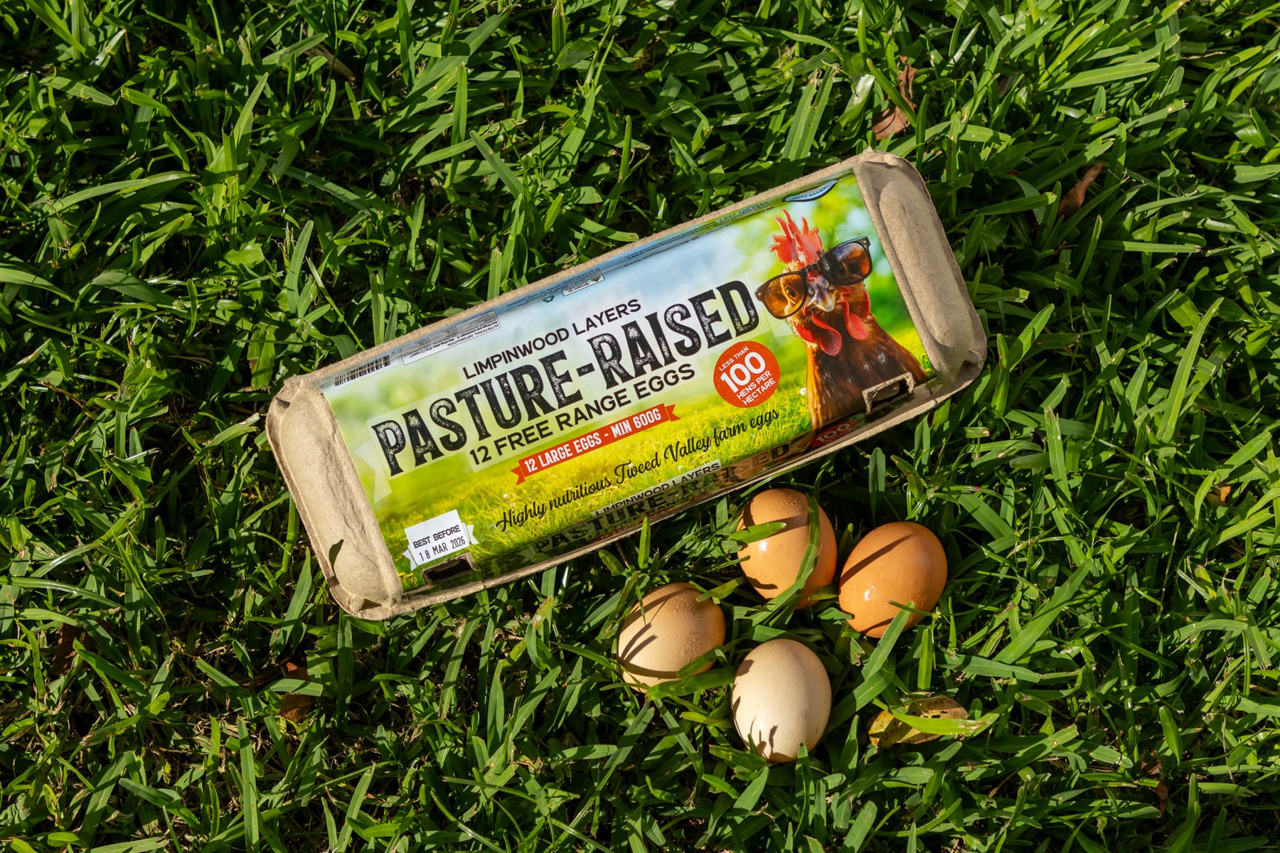
The carton is the product. It’s what a customer picks up, reads, puts back, or puts in their basket and fridge. Every element had to earn its place.
The sunglasses-wearing chicken hero sits front and centre – bold enough to pop from a shelf of brown kraft and muted tones. Supporting copy keeps it real: clear welfare claims, farm story, and the kind of language that feels like it comes from an actual human, not a marketing department.
The result is a carton that feels premium without being pretentious – and distinctive enough that customers know exactly what they’re looking for on their next shop.
Point of Sale Posters
Great packaging only works if the product is visible. Point of sale materials were designed to stop foot traffic, build brand recognition, and communicate the Limpinwood difference at the moment of purchase.
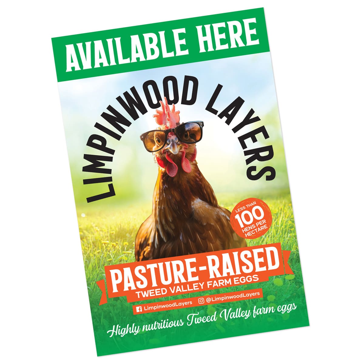
A single 600x900mm coreflute sign for independent retailers – designed to do one job: stop a customer, communicate the brand, and move product.
The format had to work hard. Coreflute lives in busy retail environments – produce sections, farm gate stalls, independent grocers – competing against handwritten specials boards and cluttered shelving. The Limpinwood character owned the space immediately.
Bold hero graphic. Minimal copy. The chicken does the heavy lifting so the retailer doesn’t have to explain what makes this egg different – the sign does it for them.
T-Shirt Design
The Limpinwood Layers t-shirt was designed for staff – the people who man markets and deliver cartons directly to customers. It’s a uniform, but it doesn’t feel like one.
When your staff wear the brand with pride, it does something no signage can – it makes the brand feel human. Customers aren’t buying eggs from a label, they’re buying from someone who clearly gives a damn.
Design direction: The sunglasses chicken, elevated. A slightly grittier, more editorial take on the character – bold line work, high contrast, built for screen DTG. The kind of graphic that actually gets worn rather than folded and forgotten.
The Results
Limpinwood Layers consistently sells out. The character is recognised. The carton gets photographed and shared. The brand has become bigger than the product – which is exactly the point. Going so well they have doubled the number of chickens, looks like they will also need more sunglasses!
In a category where most brands try to out-certify each other, Limpinwood Layers out-personalities them. And personality, it turns out, moves product.